Viewing and customizing charts in Service Dashboard
You can interact with the charts to filter data and customize views.
-
From the main menu on the left side of the screen, select the Service (
 ) > Service Analytics.
The SERVICE ANALYTICS screen opens to the Service Dashboard.
-
Do the following:
-
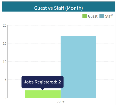
To view information about specific data points in a chart, hover your mouse pointer over elements of the chart.
As you move the pointer, relevant graphical elements are highlighted and tooltips update to display information for the datapoints. .
. -
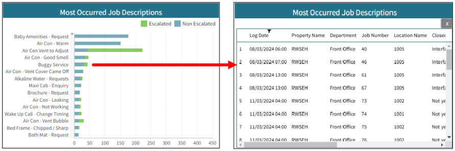
Click a chart element (bar, pie slice, line, and so on) to open a table with more details and information related to that specific data point in the chart.

To return the table to its graphical view, click X in the upper-right corner.
-
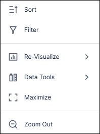
To filter or customize chart views, right-click a chart and select from the various menu options.

Note: Menu options might vary for different charts.
Customization menu options for charts
Menu option Description Notes 
Sort
Depending on the chart or table, you can sort by various options.

Filter
Provides options to filter by work order status and count, as well as an option to clear an applied filter.

Re-Visualize
Offers a selection of various chart visualization types to apply the selected chart. For example, you can change a bar chart to a pie chart.

Data Tools
Provides options for freezing or refreshing data. Freezing is useful when you temporarily do not want the data to update with the latest data sync. Refreshing the data either resumes data syncs after being frozen or refreshes the chart to show data from the latest sync.
 /
/ 
Maximize / Restore Down
Select Maximize (
 ) to expand the selected chart to a full-screen view.
 Select Restore Down (
 ) to return the maximized chart to its minimized view.
 /
/ 
Zoom Out / Zoom In
Select Zoom Out (
 ) to decrease the level of detail but increase the scope of displayed data.
 Select Zoom In (
 ) to increase the level of detail of displayed data.
This option is not available for all charts.
-